
Essentials for YOOtheme Pro
Input Element
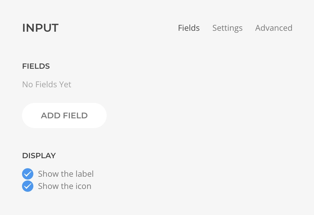
The Input Element displays a grid of <input> HTML elements with support for text, date, email, number, password, tel, url, month, time, and week types. Each type is wrapped into a child element with its specific features and validation covered in the next sections.
Set multiple children of any type and control the display, grid, and settings of all of them within the parent with an option to override.
| Setting | Description |
|---|---|
| Show Label | Should the label be displayed for all children. |
| Show Icon | Should the icon be displayed for all children. |
| Setting | Description |
|---|---|
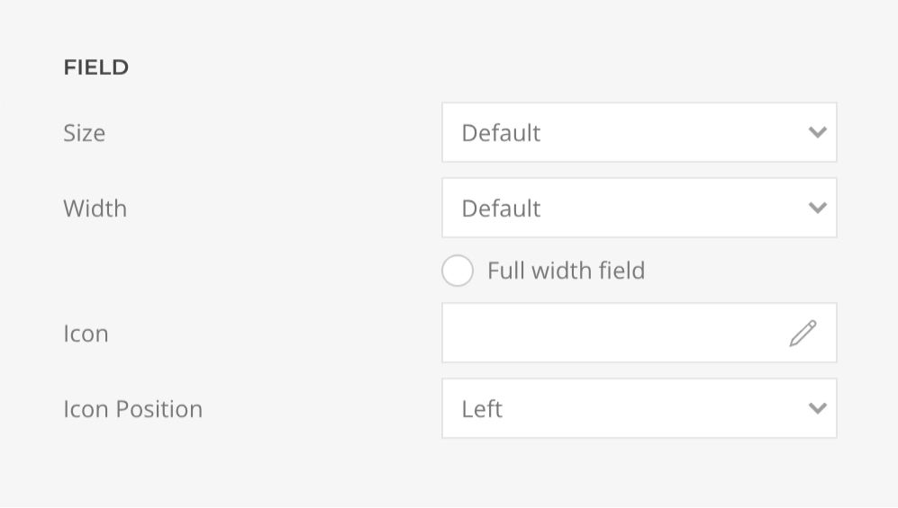
| Size | The field size defined by uk-form-{size} modifier. |
| Width | The field width defined by uk-form-width-{width} modifier. |
| Full Width | Should the field occupy the full width of its parent. |
| Icon | The name of the Icon that will be displayed inside the field. |
| Icon Alignment | The side of the field where the icon will be aligned, Left or Right. |
| Setting | Description |
|---|---|
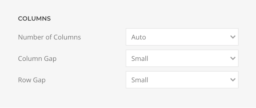
| Number of Columns | The amount of grid columns. |
| Column Gap | The size of the gap between grid columns. |
| Row Gap | The size of the gap between grid rows. |
Input Text Element
Child of Input Element, the Input Text Element displays a <input type="text"> HTML element, use it to create one-line text fields.

| Setting | Description | Dynamic |
|---|---|---|
| Placeholder | The text to be shown while there is no user input. | ✓ |
| Validation | Description | Dynamic | Browser Side | Server Side |
|---|---|---|---|---|
| Min Length | The minimum content length that the input value must constrain to, greater than or equal to. | ✓ | ✓ | ✓ |
| Max Length | The maximum content length that the input value must constrain to, lower than or equal to. | ✓ | ✓ | ✓ |
| Pattern | The regular expression pattern that the input value must match to. | ✓ | ✓ | ✓ |
Input Number Element
Child of Input Element, the Input Number Element displays a <input type="number"> HTML element, use it to create one-line fields restricted to numerical entries. The browser may opt to provide stepper arrows to let the user increase and decrease the value using their mouse or by tapping with a fingertip.

| Setting | Description | Dynamic |
|---|---|---|
| Placeholder | The text to be shown while there is no user input. | ✓ |
While the browser validation invalidates any entry that isn't a number, it inherits common validation with the following specifics:
| Validation | Description | Dynamic | Browser Side | Server Side |
|---|---|---|---|---|
| Min | The minimum amount that the input value must constrain to, greater than or equal to. | ✓ | ✓ | ✓ |
| Max | The maximum amount that the input value must constrain to, lower than or equal to. | ✓ | ✓ | ✓ |
Input Date Element
Child of Input Element, the Input Date Element displays a <input type="date"> HTML element, use it to create one-line date edit fields.

Styling Limitations
Date input relies on the browser's native implementation, the picker and icon style is inconsistent and its customization is not possible.
| Setting | Description | Dynamic |
|---|
WARNING
Browser does not apply any validation other than the user agent's interface, when supported, restricting the input to a date value. As we cannot entirely rely on the browser, a date format validation is performed on the server side.
| Validation | Description | Dynamic | Browser Side | Server Side |
|---|---|---|---|---|
| Min | The minimum date that the input value must constrain to, greater than or equal to. | ✓ | ✓ | ✓ |
| Max | The maximum date that the input value must constrain to, lower than or equal to. | ✓ | ✓ | ✓ |
TIP
When using dynamic values for date fields, always format them as Y-m-d (e.g., 2026-06-22).
Input Email Element
Child of Input Element, the Input Email Element displays a <input type="email"> HTML element, use it to create one-line e-mail address edit fields.

| Setting | Description | Dynamic |
|---|---|---|
| Placeholder | The text to be shown while there is no user input. | ✓ |
WARNING
Browser-side validation ensures that only text that matches the standard format for Internet e-mail addresses is entered. If you need the URL to be restricted further you can set a regular expression pattern.
| Validation | Description | Dynamic | Browser Side | Server Side |
|---|---|---|---|---|
| Min Length | The minimum content length that the input value must constrain to, greater than or equal to. | ✓ | ✓ | |
| Max Length | The maximum content length that the input value must constrain to, lower than or equal to. | ✓ | ✓ | |
| Pattern | The regular expression pattern that the input value must match to. | ✓ | ✓ | ✓ |
Input Time Element
Child of Input Element, the Input Time Element displays a <input type="time"> HTML element, use it to create one-line time edit fields.

Styling Limitations
Time input relies on the browser's native implementation, the picker and icon style is inconsistent and its customization is not possible.
| Setting | Description | Dynamic |
|---|
WARNING
Browser does not apply any validation other than the user agent's interface, when supported, restricting the input to a time value. As we cannot entirely rely on the browser, a time format validation is performed on the server side.
| Validation | Description | Dynamic | Browser Side | Server Side |
|---|---|---|---|---|
| Min | The minimum time that the input value must constrain to, greater than or equal to. | ✓ | ✓ | ✓ |
| Max | The maximum time that the input value must constrain to, lower than or equal to. | ✓ | ✓ | ✓ |
TIP
When using dynamic values for time fields, always format them as H:i (e.g., 14:30 for 2:30 PM).
Input Url Element
Child of Input Element, the Input Url Element displays a <input type="url"> HTML element, use it to create one-line url edit fields.

| Setting | Description | Dynamic |
|---|---|---|
| Placeholder | The text to be shown while there is no user input. | ✓ |
Browser-side validation ensures that only text that matches the standard format for URLs is entered. If you need the URL to be restricted further you can set a regular expression pattern.
| Validation | Description | Dynamic | Browser Side | Server Side |
|---|---|---|---|---|
| Min Length | The minimum content length that the input value must constrain to, greater than or equal to. | ✓ | ✓ | ✓ |
| Max Length | The maximum content length that the input value must constrain to, lower than or equal to. | ✓ | ✓ | ✓ |
| Pattern | The regular expression pattern that the input value must match to. | ✓ | ✓ | ✓ |
Input Password Element
Child of Input Element, the Input Password Element displays a <input type="password"> HTML element, use it to create one-line text field where the user can input it password without it being visible. The text is obscured usually by replacing each character with a symbol such as an asterisk (*) or a dot (•). This character will vary depending on the user agent and operating system.

| Setting | Description | Dynamic |
|---|---|---|
| Placeholder | The text to be shown while there is no user input. | ✓ |
| Validation | Description | Dynamic | Browser Side | Server Side |
|---|---|---|---|---|
| Min Length | The minimum content length that the input value must constrain to, greater than or equal to. | ✓ | ✓ | ✓ |
| Max Length | The maximum content length that the input value must constrain to, lower than or equal to. | ✓ | ✓ | ✓ |
| Pattern | The regular expression pattern that the input value must match to. | ✓ | ✓ | ✓ |
Input Month Element
Child of Input Element, the Input Month Element displays a <input type="month"> HTML element, use it to create one-line month edit fields.

Styling Limitations
Month input relies on the browser's native implementation, the picker and icon style is inconsistent and its customization is not possible.
| Setting | Description | Dynamic |
|---|
WARNING
Browser does not apply any validation other than the user agent's interface, when supported, restricting the input to a date value.
| Validation | Description | Dynamic | Browser Side | Server Side |
|---|---|---|---|---|
| Min | The minimum month that the input value must constrain to, greater than or equal to. | ✓ | ✓ | ✓ |
| Max | The maximum month that the input value must constrain to, lower than or equal to. | ✓ | ✓ | ✓ |
TIP
When using dynamic values for month fields, always format them as Y-m (e.g., 2026-06 for June 2026).
Input Tel Element
Child of Input Element, the Input Tel Element displays a <input type="tel"> HTML element, use it to create one-line telephone number edit fields.

| Setting | Description | Dynamic |
|---|---|---|
| Placeholder | The text to be shown while there is no user input. | ✓ |
| Validation | Description | Dynamic | Browser Side | Server Side |
|---|---|---|---|---|
| Min Length | The minimum content length that the input value must constrain to, greater than or equal to. | ✓ | ✓ | ✓ |
| Max Length | The maximum content length that the input value must constrain to, lower than or equal to. | ✓ | ✓ | ✓ |
| Pattern | The regular expression pattern that the input value must match to. | ✓ | ✓ | ✓ |