
Essentials for YOOtheme Pro
Form Field Elements
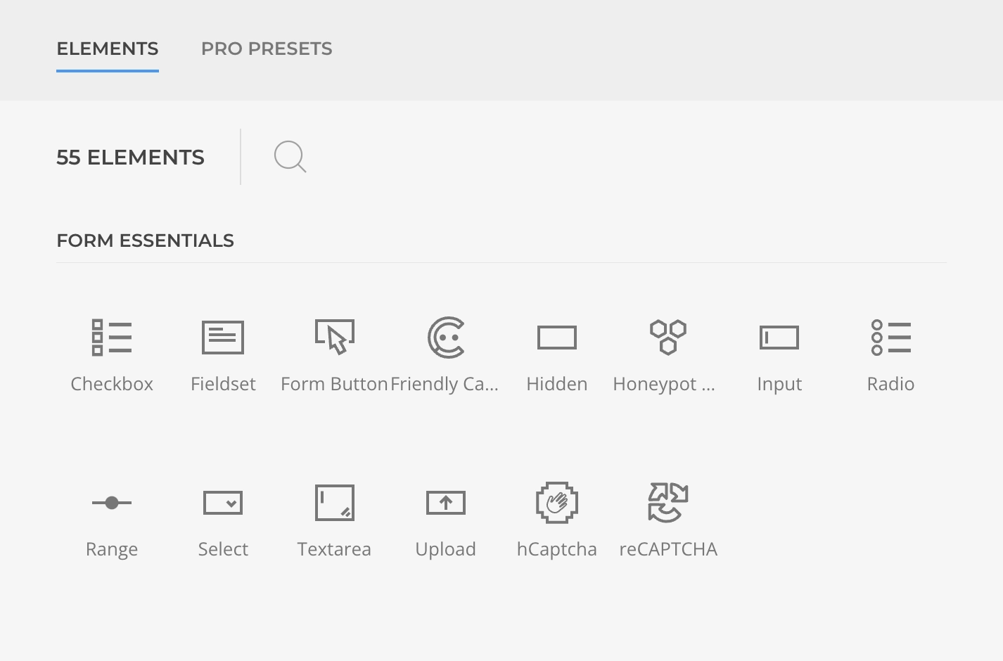
Form Field Elements are YOOtheme Pro builder elements used to structure a Form Element and define data specifics. Those are grouped under Form Essentials builder element library.
Available Elements
Essential Forms provides a comprehensive set of form field elements to build any type of form:
Input Elements
- Input - Text, number, email, date, and other input types
- Textarea - Multi-line text input
- Range - Slider input for numeric values
Selection Elements
- Select - Dropdown selection
- Checkbox - Multiple choice options
- Radio - Single choice from multiple options
Action Elements
- Button - Submit and reset buttons
File Elements
- Upload - File upload functionality